Interior design
Interior design describes a group of various yet related projects that involve turning an interior space into an effective setting for the range of human activities that are to take place there. It’s thought that the first real forays into interior design were by the Egyptians, who would decorate their huts with various pottery pieces, textiles and murals. Furniture in Egypt was usually highly intricate and of course, the tombs of the Egyptian kings and queens are some of the most luxurious ever seen, with priceless arts, treasures and carvings being packed into several rooms.
The Greeks and Romans also prioritised making their homes beautiful, with delicate mosaics and marble pieces being extremely popular. The look at this time placed a great emphasis on luxury and expert craftsmanship, and many pieces from these ancient civilisations still survive today.
After the extravagance and opulence of the Roman period, Britain entered possibly its lowest point in art and design. The Dark Ages arrived, with austerity and sober designs becoming the order of the day. Many of the poor didn’t bother to decorate their homes at all, relying on stone flooring and simple furniture, as even the previously beautiful churches made do with simple carvings in dark wood.
Within a couple of centuries it was completely different, as the Italian Renaissance led to plenty of marble floorings and expensive upholstery being found in the homes of the rich. The other big change was the invention of wallpaper, which was made using the newly-invented printmaking machines. Wallpaper offered a nice alternative to huge tapestries and was soon found in every wealthy home across Europe; the grander and more delicate the design, the better.
Although wallpaper was initially only something that the rich had, better technology and two world wars soon saw this change. Both wars led to a shortage of paint across Britain, meaning that the demand for cheap yet attractive wallpaper rose. Soon, wallpaper had replaced paint in the nation’s affections.
The late 90s saw interest in interior design skyrocket thanks to TV makeover shows like Changing Rooms. Such programmes would take an ordinary house and attempt to transform it within just a few days, providing viewers with plenty of tips on how to make the most of their homes. Emphasis also began to be placed upon the home being a place to relax from the everyday stresses of modern life, thanks to the seemingly endless TV channels and games consoles that were being brought out at the time. As a result, living room furniture changed slightly in design, with uncomfortable showpieces being eschewed in favour of more comfortable items; recliner chairs and beautiful coffee tables were very popular.
This now brings us to the present day. Today, many property shows focus on how the design of the home can alter its ultimate value, as well as offering tips on how to entice potential buyers. Shows such as Escape to the Country have also given buyers a stronger idea on exactly what they want from their dream home.
Interior of egyptian period:
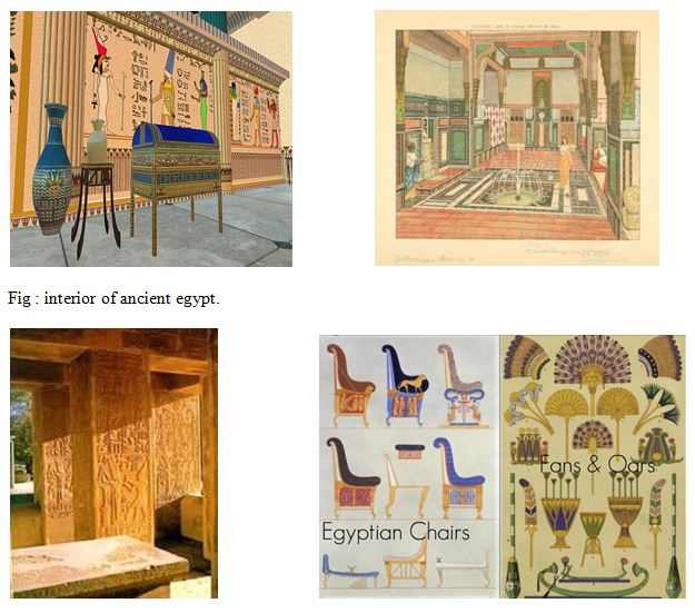
The Egyptians brought many innovations to the world, and their influence on interior design is no different. A traditional Egyptian interior design is laden with large furniture, area rugs and bold-colored fabrics. Adapt this style by selecting intricately carved furnishings in traditional European styles, with particular emphasis on French styles such as baroque and rococo. Use two to three couches, including chaise lounges, in the living room. In the bedroom, select large beds with high headboards in dark wood.
If possible, add marble flooring and layer it in thick, graphically designed area rugs depicting Egyptian cultural symbols. Scatter large floor pillows around the room.
They made floor-to-ceiling curtains for window treatments. Select either silk or linen fabric for the curtains, and include a cornice board upholstered in the same material.
They use artwork depicting ancient Egyptian gods, such as Bast the cat goddess and Isis the Egyptian mother goddess. The artwork can take the form of a wall mural and tell the story depicting that particular god’s adventures or relationship to the people of Egypt.
The Egyptians are known for their bold, colorful designs, ornate carvings and of course, the intricacy of the patterns and hieroglyphics. Ancient Egyptian décor incorporates all of these elements, bringing the best of Egyptian style to a modern world. One of the easiest ways to introduce ancient Egypt into your interior design scheme is through accessories. Some common accessories inspired by this culture include:
• Bastet Cat statues/paintings of Bastet cats – Cats were considered to be sacred beings by the ancient Egyptians because they were believed to personify the goddess Bastet. Bastet was thought to be daughter or Ra and the goddess of pleasure and motherhood.
• Ankhs – The ancient Egyptian symbol of life force is often used in jewelry as well as being incorporated into interior design.
• Canopic Jars – Canopic jars were the jars Egyptians used to store the internal organs of the dead that were removed when bodies were mummified. They come in sets of four, representing the four sons of Horus, and each jar is decorated with a different god charged with protecting the organs of the dead so they could be used in the next life. Sound a tad gruesome for your home design? No internal organs involved in modern canopic jar versions – they essentially resemble Egyptian inspired Russian dolls and are exceedingly popular.
• Busts – The Egyptians loved to glorify their leaders and their gods with ornate and exceedingly complex busts, and so these designs have endured in modern Egyptian inspired designs. You can find busts of everyone from Cleopatra and Nefertiti to Bastet cats and the sun god Ra.
• Reliefs – Reliefs featuring both hieroglyphics and depictions of gods and rules are common.
• Mummies – Of course, you can’t discuss ancient Egypt without talking about mummies. Representations of mummies are used regularly in Egyptian inspired interior design. These representations can take many different forms, from statues of mummies to reliefs and paintings of mummies and mummification process to sarcophagus statues that open up to reveal a mummy resting inside. Like canopic jars, using mummies in your home décor might sound a little creepy to some readers, but remember that to the ancient Egyptians, death was very much a stepping stone into a different kind of life and was not a tragic event – hence the idea behind the process of mummification.
• Figurines – Like the busts, ancient Egyptians also liked to honor their gods and their leaders with small figurines depicting them in battle or simply in a regal pose
Interior of ancient greece:
Ancient Greek Interior Structure
Both marble palaces and whitewashed stone houses are considered “ancient architecture” styles in Greek history. Elaborate stone cuttings and mortar were used to create stone areas and paths on the ground floors of Greek homes, patios and terraces. Interior walls may feature beautiful murals if a homeowner had a creative bent or knew of an artisan willing to undertake the job. Openings leading from room to room in the typical ancient Greek home were frequently curved; it was unusual for a house to have interior doors. Hand-loomed textile rugs hung from walls and covered floors, adding touches of color to individual rooms. Handcrafted curtains, usually embroidered with all sorts of colorful designs by the household’s women, hung over windows as well.
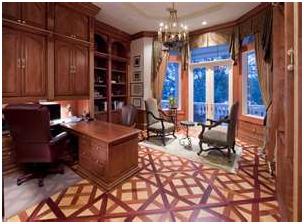
Walls, Floors and Other Features
Elaborate stone cuttings and mortar were used to create stone areas and paths on the ground floors of Greek homes, patios and terraces. Dwellings with a second story were fitted with wood floors, both for ease of installation and to counter the weight issue. Interior walls may feature beautiful murals if a homeowner had a creative bent or knew of an artisan willing to undertake the job. Openings leading from room to room in the typical ancient Greek home were frequently curved; it was unusual for a house to have interior doors. Curved roofs, typical of architecture in the Mediterranean region, are commonplace. Not every home had a solid front door.

Ancient Greek Furnishings
Greek furniture makers followed Egyptian design lines when crafting furnishings, and materials didn’t differ much, either. Oak, cedar, olive, boxwood, maple and ebony woods in the hands of skillful Greek carpenters became chairs, tables, couches, stools and beds. Greek carpenters added distinct ornamentation to furniture, including copper, bronze and iron embellishments. Wood veneer trim also provided a popular way to decorate furniture in ancient Greece
Interior Rooms
In ancient Greece, it wasn’t unusual for men and women to sleep apart in dormitory-like wings, particularly if a family was large. Washing areas were as important in a floor plan as the hearth. If a homeowner was wealthy enough to afford clay pipes to bring water from aqueducts, the family could bathe with fresh running water. Otherwise, women collected water from wells, brought it to the washroom and carried the dirty water back out. Hand-loomed textile rugs hung from walls and covered floors, adding touches of color to individual rooms. Handcrafted curtains, usually embroidered with all sorts of colorful designs by the household’s women, hung over windows as well.
Interior of the Roman period:
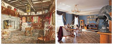
Houses changed greatly while Rome was growing. Until the last century of the Republic, houses were small and simple, with little decoration. Bright colours were used simply and appealingly to brighten interiors. Eventually, however, things became much more ornate.
Ceilings were vaulted and painted in brilliant colours, or they were divided into panels by beams. These ceilings are sometimes imitated by modern architects. Doors were richly paneled and carved, or plated with bronze, or made of solid bronze. Doorposts were sheathed with beautifully carved marble. Floors were covered with contrasting marble tiles or with mosaic pictures. The most famous of these is “Darius at the Battle of Isus,” measuring 16 feet by 8 feet, with about a 150 separate pieces in each square inch.
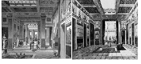
Our knowledge of Roman furniture comes from the stone and metal articles which have come down to us, the restorations made from platter casts made in Pompeii and Herculaneum, and the references in literature and depictions in art. The Romans were not big fans of furniture, but what they had was usually of rare and expensive materials, fine workmanship, and graceful form.. Even wealthy homeowners had mostly essential articles: couches, chairs, tables and lamps. Couches were extremely popular. They were often extremely ornamental. A couch (lectus) could act as a sofa and a bed. In its simplest for it would be a wooden frame, with a back and one or two arms, with straps interwoven across the top, on which a mattress was laid. A couch always had pillows, a mattress, and coverlets.
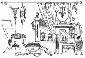
The primitive form of Roman seat was a four-legged stool or bench with no bench. Some could be folded. The famous curule chair, to which only high magistrates were entitled, was a folding stool with curved legs of ivory and a purple cushion. The first improvement on the stool, was the solium, a stiff, straight, high-backed chair with solid arms, so high that a footstool was necessary. This was the chair in which a patron sat when he received clients in the atrium. Poets represented it as a seat for gods and kings.
The design of tables was extremely varied. They were often very beautiful. Their supports and tops were made of fine materials – stone or wood, solid or veneered, or even covered with thin sheets of precious metal. The most expensive were round tables made from cross sections of citrus wood, the African cedar. Chests were found in every house. They were usually made of wood and often bound with iron. Small chests, used as jewel cases, were sometimes made of silver or gold. Cabinets were made of the same materials as chests and were often beautifully decorated.
Roman doors and doorways gave opportunities for equally artistic treatment. Doors were elaborately paneled and carved, or were plated with bronze, or made of solid bronze. The threshold was often of mosaic as in the picture above. The postes were sheathed with marble ordinarily carved in elaborate designs, as in the picture below.
The Romans produced heat with their charcoal stoves, or braziers. These were metal boxes which held hot coals. They were raised on legs and provided with handles.
The clock as we know it did not exist in Roman times. In the peristly or garden there was sometimes a sundial, which measured the hours of the day by the shadow of a stick or pin. The sundial was introduced from Greece in about 268 B.C. A sundial gives the correct time twice a year if it is calculated for the spot where it stands. Since the first Roman sundials were brought from Greek cities, they did not give the exact time. The largest at Rome was set up by Augustus, who used an Egyptian obelisk for the pointer and had lines of the dial laid out on a marble pavement..
Romans had very simple (but often very ornate) lamps: containers for olive oil or melted fat, with loosely twisted threads for the wick(s), drawn out through one or more holes in the cover or the top. There was also usually a hole through which the lamp was filled. As there was no chimney, the flame must have been uncertain and dim. Some lamps had handles. Some were suspended from ceilings with chains. Others were kept on stands. For lighting public rooms there were tall stands like those of our floor lamps, from which numerous lamps could be hung. This was called a candelabrum. It must have originally been intended for candles, but they were rarely used as the Romans were not skilled candlemakers. A supply or torches (fasces) of dry, inflammable wood, often soaked in or smeared with pitch, was kept near the outer door for use at night. Light was reflected from polished floors and from water in the impluvium.
Interior of Renaissance period :
While designing a house in the Italian Renaissance style is not an easy task, with all of the proper details and scale, furnishing one can be difficult as well. With a little research, hard work and attention to appropriate styles of mantels, lighting and architectural details you can accomplish the look. In addition, finding the appropriate furniture is important as well.
The below is antique mantels that would be appropriate for either formal or informal (say a family room). However, I would use both of them in either place.
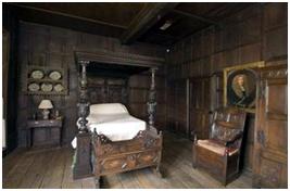
The mirror below, and the portrait, are perfect examples of pieces that would be great for an Italian Renaissance house. Of course, I am not opposed to using French Trumeau’s such as the one mentioned in my French Interiors post to go above the mantels shown above as well.
Here are two more pieces that are great to incorporateThey also found a fountain similar to the one below that we converted into a pedestal sink for their powder bathroom by carefully drilling holes in the back and mounting a wall mount faucet. Lamps,designed tables are also seen in their houses. These chandeliers are great examples of what would be appropriate for an Italian Renaissance house.
Color and Texture
Colors prevalent in the decor of the Renaissance era can be found in the artwork of the times. Great masters captured images of life during that time, including the fabrics and textures used. Rich velvets, shimmering gauzes and silk damasks were all used for wall coverings and draperies as well as clothing. Vibrant jewel-like colors complemented by warm earth tones and primary colors became the palette used in all aspects of tapestry, cloth, upholstery, bedding and carpets. This same style can be applied today in much the same manner. Choose rich earth-tone paint or venetian plaster for wall coloring and frame windows with a sheer gauze curtain layered with heavy drapes of jewel-toned velvet. Textured, flocked and embossed wallpaper is also available to duplicate that damask look and feel. Use accent pillows made of silk or velvet to complement dark leather furniture. Concentrating first on the color and texture you are bringing to the room will start the process of bringing this era into the current century.
Accessories and Accents
Gilding and hand-painted accents are featured on many of the accessories you can use to reflect this style. Ornate gold frames for oil paintings, big marble urns and statuary make bold statements as decorations around the room. Gold tassels for draperies are also excellent accents and add richness to the window treatments. To finish the design, place additional accents including leather and hide-bound books or journals, old pewter, tarnished copper and old leaded glass around the room.
Furnishings
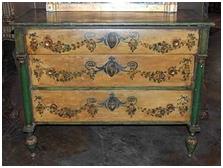
Heavy furnishings in dark wood and leather are often considered Renaissance style. Furniture was chosen as much for its artistic look as for the functional nature of the piece. Hand-carved scrollwork and embellishments on legs, arms and backs of chairs, as well as on doors, legs and tops of tables and cabinets, all generate the look of this era’s furnishings. Rich upholstery and leather accents are also prevalent.
Interior of Baroque period :
Baroque style is dramatic and opulent, and can transform a simple home into something flamboyant. Used predominantly in Louis XIV’s Palace of Versailles, baroque style boasts of bold colors, luxurious textiles, carved wooden furniture, gold or silver trims, exquisite art pieces and crystal chandeliers. If you are considering decorating your space with a baroque style.
Wall Treatments
Achieving a baroque style starts with walls. Choose dark and bold colors such as deep red or hunter green to enhance the look of the room dramatically. Gilded furnishings and art pieces look more prominent against a dark colored background.
Using boiserie, a type of wood paneling with intricate details, will add character to your walls. Wainscoting and moldings added to the walls can give walls more depth. Choose wallpapers with bold and sophisticated prints such as damask and floral, embellished in gold or silver.
Fabric wall treatments are also common in a baroque design. Gathering the top and bottom of the wall fabrics to create pleats can add volume. Embellish walls with mirrors similar to the Hall of Mirrors at the Palace of Versailles, where paneled mirrors hung wall to wall.
Floors.
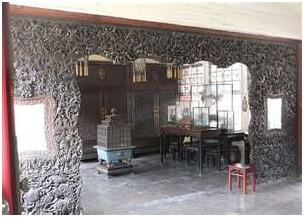
Using high-end materials such as marble or wood for your floors will do well in a baroque style. Wood and marble with inlay designs can add character and sophistication. Placing room-sized, hand-woven area rugs in European style will warm up and soften the room.
Furniture
A baroque style room is not complete without baroque furniture. Furnishing a room with Louis IV-style furniture pieces with curvy legs and intricate carving, best characterizes a baroque style home. Sofas and chairs should have high-end upholstery. Classic baroque furniture may have gilding on the details to make it look more prominent. Crystal knobs and pulls finish the look of writing desks and armoire.
Textiles
Drapes made with taffeta or silk and sewn in voluminous style will make the room look more extravagant. Choose woven and luxurious fabrics for the upholstery, window covering, bed cover, tablecloths and runners. Velvet and damask are prominent textile materials used for a baroque style.
Lighting
Using crystal chandeliers with gold or brass fixtures is the best way to light up a baroque-style home. Hang them in entryways, formal dining and living rooms. Adding matching wall sconces and lamps in rooms that need more light will make the room more cohesive. Use lampshades made with expensive fabrics to complement the other fabrics used on upholstery and drapery.
Art
Wall tapestries and paintings depicting the baroque period (1600-1750) complete a baroque design scheme. Use frames gilded in gold when framing paintings. Gold is a prominent color when choosing art pieces for a baroque style. Sculptures and vases should have intricate details.

Create wall and ceiling murals depicting a scene with classic European flair. For example, a waltz scene from the 17th or 18th century can adorn the walls and ceilings of the formal living or dining room.
Accessories
Braided and beaded tassels can adorn curtains and upholstered furnishings. Embellishing items with fringes, ribbons and cords can add sophistication.
Interior of Gothic period:
Gothic period design was influenced by Roman and Medieval architecture. Its initial design period was c.1150 to 1550, but saw a revival in the 19th century by the Victorians.
Gothic design was the first true ecclesiastical style and was symbolic of the triumph pf the Catholic church over paganism in Europe. The new age of soaring cathedrals meant the initiation of new methods of building, to support this extreme weight.
Style had a religious symbolic base- think of old, ornate churches and you will be on the right track. Pointed arches and stained glass in complex trefoil or rose designs were predominant, exposed, wooden beams, large, imposing fireplaces, and emulated candle lighting completed the ecclesiastical style. There was a strong vertical influence, supported by the high arches and peaks of the architecture. Light was also important, as windows grew more and more expansive and light and air flooded into the once gloomy churches of the Romanesque period.
Gothic Furniture
Furniture was massive and oak, adorned with Gothic motifs. Chairs, bed frames, cabinets were sturdy and featured arches, spiral-turned legs and rich upholstery in dark colors. Old church furniture such as pews, benches and trestle tables finish the look. Victorian gothic reproduction and Arts and Crafts era furniture can be used as an acceptable alternative, as many of the same motifs crossed over.
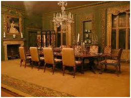
Gothic Color
Colors were rich and dark, of the Victorian era. Purple, ruby, black, ochre, forest green and gold added complemented the heavy furniture and rich design. Wallpaper was ornate and heavily patterned in natural flowers and foliage. Also popular was trompe-l’oeil architectural features or stenciled designs. Walls were painted in flat colors, to depict stones, and often covered in wall hangings- especially tapestries. Obviously stained glass was a significant feature, and these were ideally accented with pewter, wrought iron, suits of armour and candles. Decorative ribbing or cornices were common and elaborately carved. Heraldic emblems were seen everywhere.
Interior of Neo classic period:
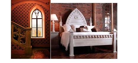
Originating in the late 18th Century, Neo Classical design is inspired by the architecture of Ancient Greece and Rome. Neo Classical furniture is a compilation of distinctive geometrical shapes; rounds, arches, rectangles and curves.
Neo Classical furniture is characterised by restrained, symmetrical design and tends to be rectangular. Architectural details and motifs are frequently utilised for decoration. The furniture legs are often turned and fluted in reference to classical architectural columns.
Upholstered and gilded chairs and sofas resemble thrones and exemplify a certain Napoleonic grandeur. Classical carved urns enlivened and provided structure for garden layouts.
Neo-classicism provides a grand statement with an element of restraint, a perennial favourite throughout history.
Neo Classical furniture, classical style in a grand statement.
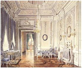
The Arts and Crafts Movement
The Arts and Crafts movement initially developed in England during the latter half of the 19th century. Subsequently this style was taken up by American designers, with somewhat different results. In the United States, the Arts and Crafts style was also known as Mission style.
This movement, which challenged the tastes of the Victorian era, was inspired by the social reform concerns of thinkers such as Walter Crane and John Ruskin, together with the ideals of reformer and designer, William Morris. (This link will take you to a less visual site that provides William Morris historical background).
Their notions of good design were linked to their notions of a good society. This was a vision of a society in which the worker was not brutalized by the working conditions found in factories, but rather could take pride in his craftsmanship and skill. The rise of a consumer class coincided with the rise of manufactured consumer goods. In this period, manufactured goods were often poor in design and quality. Ruskin, Morris, and others proposed that it would be better for all if individual craftsmanship could be revived– the worker could then produce beautiful objects that exhibited the result of fine craftsmanship, as opposed to the shoddy products of mass production. Thus the goal was to create design that was… ” for the people and by the people, and a source of pleasure to the maker and the user.” Workers could produce beautiful objects that would enhance the lives of ordinary people, and at the same time provide decent employment for the craftsman.
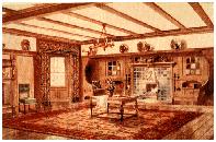
Medieval Guilds provided a model for the ideal craft production system. Aesthetic ideas were also borrowed from Medieval European and Islamic sources. Japanese ideas were also incorporated early Arts and Crafts forms. The forms of Arts and Crafts style were typically rectilinear and angular, with stylized decorative motifs remeniscent of medieval and Islamic design. In addition to William Morris, Charles Voysey was another important innovator in this style. One designer of this period, Owen Jones, published a book entitled The Grammar of Ornament, which was a sourcebook of historic decorative design elements, largely taken from medieval and Islamic sources. This work in turn inspired the use of such historic sources by other designers.
However,in time the English Arts and Crafts movement came to stress craftsmanship at the expense of mass market pricing. The result was exquisitely made and decorated pieces that could only be afforded by the very wealthy. Thus the idea of art for the people was lost, and only relatively few craftsman could be employed making these fine pieces. This evolved English Arts and Crafts style came to be known as “Aesthetic Style.” It shared some characteristics with the French/Belgian Art Nouveau movement, to be discussed below.
However in the United States, the Arts and Crafts ideal of design for the masses was more fully realized, though at the expense of the fine individualized craftsmanship typical of the English style. In New York, Gustav Stickley was trying to serve a burgeoning market of middle class consumers who wanted affordable, decent looking furniture. By using factory methods to produce basic components, and utilizing craftsmen to finish and assemble, he was able to produce sturdy, serviceable furniture which was sold in vast quantities, and still survives. The rectilinear, simpler American Arts and Crafts forms came to dominate American architecture, interiors, and furnishings in the late nineteenth and early twentieth century.
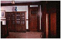
Today Stickley’s furniture is prized by collectors, and the Stickley Company still exists, producing reproductions of the original Stickley designs.
The term Mission style was also used to describe Arts and Crafts Furniture and design in the United States. The use of this term reflects the influence of traditional furnishings and interiors from the American Southwest, which had many features in common with the earlier British Arts and Crafts forms. Charles and Henry Greene were important Mission style architects working in California. Southwestern style also incorporated Hispanic elements associated with the early Mission and Spanish architecture, and Native American design. The result was a blending of the arts and crafts rectilinear forms with traditional Spanish colonial architecture and furnishings. Mission Style interiors were often embellished with Native American patterns, or actual Southwestern Native American artifacts such as rugs, pottery, and baskets. The collecting of Southwestern artifacts became very popular in the first quarter of the twentieth century.
Art Nouveau
This style, which was more or less concurrent with the Arts and Crafts style, was not at all concerned with the social reform movements of the day. Instead, it addressed the clutter and eclecticism of mid-19th century European taste. Originating in Belgium and France, this movement advocated nature as the true source of all good design. Art Nouveau designers objected to the borrowing of design ideas from the past, and even from other cultures, although the Japanese approach to nature was much admired and emulated.
The characteristics of the style included above all the use of the sinuous curved line, together with asymmetrical arrangement of forms and patterns. The forms from nature most popular with Art Nouveau designers were characterized by flowing curves– grasses, lilies, vines, and the like. Other, more unusual natural forms were also used, such as peacock feathers, butterflies, and insects.
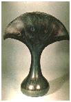
Architects and designers who contributed to the development of this style included Victor Horta , Hector Guimard (Click on Buildings and Subway in TOC on left), and Henry van de Velde. The glass and jewelry design of Lalique, as well as the stained glass and other designs of Louis Comfort Tiffany and Emile Galle (nice video at bottom of page) were important examples of Art Nouveau style.
A distinctive graphic design style developed, which included typography styles as well as a distinctive manner of drawing the female figure. The prints of Aubrey Beardsley and Alphonse Mucha are typical of this style.
Bauhaus
Bauhaus is an international movement known for inspiring the 20th Century Modern Architecture and Design. It was named after Bauhaus School of Architecture and Fine Art in Weimar. The thought-provoking ideas spread worldwide having a great influence on architecture and all arts. The origins of the Bauhaus movement of modern art and architecture date back to the controversial new school of arts and crafts which was established in Weimar in 1902 by the Belgian artist Henry van de Velde. Another art school had already been founded in 1860 which was also the subject of disputes.
The pioneering architect Walter Gropius combined both schools into the Staatliches Bauhaus on April 1, 1919 to start the Bauhaus movement which spread around the world. In 1919, Weimar had become the center of new social and political ideas when the city was chosen as the place for the writing of the constitution of the new Republic proclaimed by the Social Democrats on Nov. 9, 1918.
The central idea behind the teaching at the Bauhaus was productive workshops. The Bauhaus contained a carpenter’s workshop, a metal workshop, a pottery in Dormburg, facilities for painting on glass, mural painting, weaving, printing, wood and stone sculpting. The Bauhaus architecture featured functional design, as opposed to the elaborate Gothic architecture of Germany. Famous modern artists like Paul Klee, Lyonel Feininger and Kandinsky were invited to lecture at the school.
Art deco
Art Deco was a popular international design movement from 1925 until 1939, affecting the decorative arts such as architecture, interior design, and industrial design, as well as the visual arts such as fashion, painting, the graphic arts and film. This movement was an amalgam of many different styles and movements of the early twentieth century, including Neoclassical, Constructivism, Cubism, Modernism, Bauhaus, Art Nouveau, and Futurism.

Art Deco experienced a decline in popularity during the late 1930s and early 1940s, and soon fell out of public favor. The time frame was roughly from the World’s Fair in Paris in 1925 to the World’s Fair in New York in 1939. Afterward, Art Deco experienced a resurgence with the advent of graphic design in the 1980s. Surviving examples may still be seen in many different locations worldwide, in countries as diverse as the United Kingdom, Cuba, the Phillipines, and Brazil. Many classic examples still exist in the form of architecture in many major cities. The Chrysler building, designed by William Van Alen, is a classic example of this, as it is one of the most notable examples of Art Deco architecture today. Other prominent examples include the Empire State Building and the New Yorker Hotel in New York City.
While most of the modern art movements were grounded in ideology, Art Deco was a celebration of modern life and style, seeking elegance over philosophical content.
Famous interior designers:
Isamu Noguchi (1904-1988)
Important American abstract sculptor who has designed furniture and lighting products from time to time.
Charles Eames (1907-1978)
Eames is best known for his 1956 design of a leather lounge chair and ottoman, utilizing molded plywood units supported on cast aluminium bases. An architect and designer.
Herman Milner
American furniture manufacturer, which, under the design direction of Gilbert Rohde in the 1930s,began producing modern furniture.
Other famous designers are Rashid Karim, Laura Day, Shela Baridge, Tanya Ghayni, William Mcintosh, William Morris.
Modern furnitures :
Shanto-Mariam University of Creative Technology
